首页
Bootstrap5组件手册
进度条
基本类:
.progress                外框
.progress-bar            填充

组合类:(与 .progress-bar 填充类,配合使用)
.bg-*                 背景色
.progress-bar-striped    条纹
.progress-bar-animated  动画条纹
示例
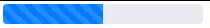
默认进度条: <div class="progress" style="width:200px;height:20px;"> <div class="progress-bar" style="width:50%"></div> </div> 注: 进度条大小 style="width:200px;height:20px;" 填充比 style="width:50%"条纹进度条: <div class="progress" style="width:200px;height:20px;"> <div class="progress-bar progress-bar-striped" style="width:50%"></div> </div>
动画条纹: <div class="progress" style="width:200px;height:20px;"> <div class="progress-bar progress-bar-striped progress-bar-animated" style="width:50%"></div> </div>